|
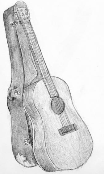
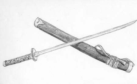
Here are two images out of my 9"X12" sketchbook that I rendered for the Drawing I course I took in college. I can’t say for sure what pencils I used, although more than likely woodless in the range of 2B to 4B (you can tell by the thicker varying line-width that these were not done with mechanical pencils ... that and this was around the time when I started using real art supplies.) Anyway, these images were homework assignments—go off and draw something on our own time. It didn’t matter what, as long as we drew something. So I drew my Alvarez Acoustic guitar with its crappy cardboard case, and a cheap katana I got off e-bay. Let’s start at the top with the Alvarez: I really could have used a straight edge for this render. Why didn’t I use that nifty 36" ruler that I picked up from Hobby Lobby? Or the 12" ruler I got around the same time? I dunno. But the render suffered for it—notice the strings have no tension on account of wobbly lines. Tight strings have no room to wobble. The frets and the neck could use a straight edge too. But, check out the side of the guitar—the grain of the wood. That was fun to shade. I remember getting marked off for not including some kind of background. This wasn’t the first time I received that criticism either. I don’t remember exactly why I didn’t draw one, but I’d wager it was along the lines of “I wasn’t interested in drawing one” ... at least, I wasn’t at the time. The reason I didn’t add one later was because, generally, if I don’t conceive the background and foreground together I’ll always see them separately in my mind when I look at the image—they’ll always look like they don’t belong together. Next up, the katana: There’s actually a weird dotted pattern on the scabbard that I simplified into static shading since the scale isn’t large enough to really communicate (not to mention render) it. The ties and the handle also carry that same pattern, but I simplified them too. The tough thing about drawing a katana is the arc of the blade—getting the exact degree correct with a single unwavering stroke (the blade is arced, yet it’s straight ... if that makes sense.) I think I did succeed in drawing the blade correctly (albeit not perfectly). There’s definitely room for improvement, but that goes back to one of my biggest flaws as an artist: having poor line-quality in my drawings. I did get a comment that the scabbard is shorter than the blade, and I’m pretty sure I was criticized for not including a background again. Anyway, both images could use a wider spectrum of value and more contrast in their shading, but that’s a consistent error in many of drawings from that era of my sketchbook’s history. |
|
|


