|
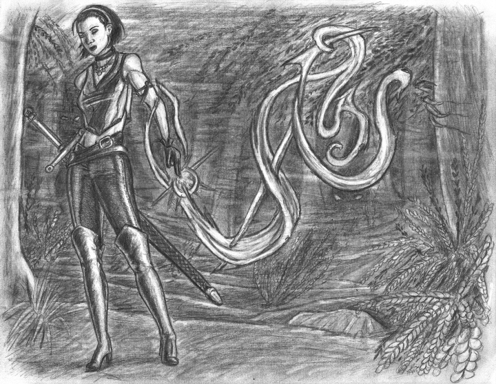
So I’ve been meaning to revisit old Dark Side renders for over a year, but other projects/subjects always sidetrack me. Here’s an instance where I (finally) followed through and kinda shot myself in the foot. Like all of my drawings at the time, the original Noria did not use the page effectively, and I sought to remedy that with this follow up. I’d draw her carving out her magical rune in the air, I’d draw the same basic background except this time I’d fill up the whole page. Thus I drew Noria as large as I could, intending to put the door entirely to her left (right of frame), effectively populating the rest of this landscape-oriented composition with stairs leading to big fancy doors ... and then I just didn’t feel like drawing the doors. “So now what?” Well, I never did arrive at a satisfactory answer. I wanted to show her power by putting a defeated adversary behind her, but I’ve already done that. Then I thought, “okay, I won’t show her opponent beaten; I’ll just show her up against a tough looking baddie,” but in essence I’ve already done that too. Then I started thinking “what kind of evil monsters can I put behind her?” But I didn’t feel like designing anything new, so eventually I settled on a spooky forest where I can abstractly show things lurking. I could suggest trees and bushes and places to hide with silhouettes and simple shapes and—yeah, none of that quite worked. Why do I hate it? Couple reasons. 1.) As I already mentioned, in trying to keep Noria and her mystic rune (which takes up just as much real estate as she does) from the original I really limited my options especially given how large I drew Noria and where I stuck her in the frame. 2.) The original has her in front of a fancy double door with steps implying an urban setting, so placing her in the forest feels like the laziest possible attempt to bring change (why not make it a creepy farm while I’m at it?) I should have expanded on the original—drawn the doors from a more dynamic angle or even have them open leading to a deep chamber or courtyard populated with other characters or something. 3. I have to hit myself again because I rail against other people when they do it: “if you're going to change something, actually change something meaningful.” The forest background is a cheap superficial non-change that pisses me off when other people do it. I should have just said, “who am I kidding? This doesn't amount to anything significant. Might as well leave it alone and be honest.” 4. The background always felt painfully layered like a series of crappy mismatched cardboard cutouts stacked on top of each other which I knew I could eventually fix with lots of subtle shading; however, I really did not want to put in that much time and effort into a background I still wouldn’t like on a conceptual level. 5. It soon became apparent I couldn’t get it as dark as I wanted without spending an eternity shading, opening the door for smearing or graphite simply being lifted off the page by my hand as I continued to draw (taking away the darkness). 6. While my backgrounds have certainly improved, I’m still not happy with the level of depth and sense of scale I’m able to render (it looks like a shallow miniature). Oh well. Complete hatred does have its perks though: I’ve never been less timid about experimentation. When the dark forest wasn’t working out, I thought maybe I could use my eraser to create a fog effect. Would I ever try that with a background I’m happy with? Hell no. I don’t think the fog effect quite works but, hey, I tried. And, you know what? I think it looks much better than it did before. Which leaves the question: why did I keep working on a render I didn't like and upload it to Dark Side of the Soul? Well, the point of the original was Noria, herself, and I think this is one of my better human figures (sans source). I’ve done figure drawings almost exclusively over the past few weeks, and I think that’s reflected in the level of detail in Noria. In particular I’m pleased with the relaxed naturalness of her pose and the behavior of her clothing which shows signs of draping/stretching to accommodate the body underneath. Lastly, sometimes when you revisit old works and start tinkering around with the various elements you lose the essence of the original, and sometimes an inferior original has something more appealing than a superior remake (which happens very frequently in cinema.) The word I go to describe that invisible unquantifiable something is charm. You probably couldn’t tell from its commentary, but the original Noria has always been one of my favorites from that era of Dark Side’s history (flaws, personal clichés, and all—it’s a more charming image than any of the others in that first column). So it occurred to me that in revisiting it I could very well wind up with a technically superior drawing that I didn’t like as much (especially considering my intense displeasure at the background.) But I think the 2012 version actually captures the spirit of the original even better than the original. As much as I don’t like the forest, as much as I think the double doors is a better idea (if less skillfully executed), both renders are really about Noria Grey. She’s the focus. And she’s a sexy badass mage/swordswoman because D&D and other RPGs at the time always drove me crazy with how characters couldn’t be both. I guess what I’m getting at is hands down Noria looks better—hotter—now than she’s ever looked, and she kicks ass too.
—Jay Wilson Also available: Noria Grey, Take One |
|
|

